Harvester – Game Jam Retrospective
Well, the jam has concluded, and with my spooky holiday over and a bit of distance between me and the active making of Harvester, I figured I'd take the time to reflect on what went well, what didn't, and y'know, retrospective stuff.
In mid-September, I knew I was gonna start a horror game for October. I thought, if no jams appeal me, I have a pretty good idea for a 3D game. Even though I keep trying to pull myself away from RPG Maker 2003, I could not resist the temptation to make an RPG Maker horror game, so when I saw this jam I jumped at the chance.
Overall, I'm glad I took on the challenges I did, and I'm happy with the game itself.
What Went Well
Game Tech & Mechanics
I think this is where Harvester really shines. I came up with something that was, technically speaking, a bit outside of what RPG Maker 2003 was made for, and I had to put in a lot of work and planning to ensure that event logic was correct and that things wouldn't bug out hard.
There were a lot of interlocking mechanics and custom menus, and those menus were really complex to execute against this engine. I got it all working, and with some iteration and help from playtesters, managed to make a relatively bug free core game loop.

So...many...common events.
At this point, I'm pretty confident in saying that I have mastered this engine.
I can't say whether the game's economics are even remotely balanced in the way I want because I don't have much feedback to work from, but from what I do have, it seems like my game is just on the side of 'challenging' that I want it to be, and watching my fiancee play through the day night cycle for most of the week made it obvious that I established the right level of tension, at the very least.
Also, taking the time to hammer out the mechanics before doing any unnecessary art was, easily, the best call I made in this entire jam. I usually let myself get distracted with art and style before I know if the game even feels like a game, and I just knew I couldn't make that mistake with so much on the line 'engineering'-wise.
Art – The Good
I think my art was pretty good, for the most part! I'm generally happy with my environment assets and the level of detail I was able to squeeze into the constrained tilesets. Once I got a range of colours I was happy with, recycling colours and their brightness ranges contributed to some aesthetic cohesion. I also decided from early on that I wasn't going to use dithering for my assets, using as much (or as little) colour depth as necessary to communicate. That choice in particular was definitely pivotal in my ability to get some of the grungy, decrepit vibes into the art.
The Harvester's walk cycle, turn around, and other animations were passable for something I did in a single day, and my menu icons worked out well. Making characters is hard, but now that I've got a workflow established in Aseprite, the process of setting up The Harvester and creating new poses was smoother than previous characters, which I usually created in Photoshop (which isn't terrible for pixel art, but I'm learning to love Aseprite more and more each day). I'm still not sure about their palette (especially the bright green cloak, like, what the hell was I thinking?), but I at least got one thing right: making them brighter to stand out from the environment.
Early on, I knew I wanted to fit a lot of 'butchered' cuts onto the screen. 16 pixels was not enough space for readability, so I'm glad I made the call of supplementing that visual uh...'information'...with menu text. I wouldn't necessarily call this an artistic 'win', but an understanding of limitations both technical and competence-wise.
Plus, even though my title 'font' is a bit wonky, I thought it lent well to the exaggeratedly visceral madness I was aiming for. If I had more time, I would totally have animated those blood drips.
What Went Okay
Sound Design & Music
Typical dev cycle move: I wound up doing sound near to the very last minute with almost no forethought except for a guitar lick.
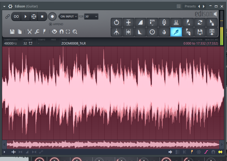
The main win I got out of this was learning just how nicely Edison's noise profiling is; its defaults produced a way cleaner sound than anything I got using Adobe Audition, which makes me happy, because every step away from subscription software is a plus in my books. The classical guitar is way cleaner than I could have dreamed (despite my playing), and taking the risk on using that tool for the first time was a gamble that paid off. I really wanted guitar music for this, and I was glad to get it for the snippets I needed.

That lovely little toothbrush did some serious heavy lifting.
Sound design-wise, I had a specific goal: everything needed to be meaty. I did my best to make sure that UI clicks were full of squishy, bone snappin energy. A bit of EQing went a long way, and riffling through my sample library to build the right layered effects was a blast. The butchering sequence was pretty satisfying when it came together.
There was one serious disappointment though: as part of making the last day more dramatic, I wanted the villagers to be driven mad, and I wanted to record some friends from out of town making all sorts of crazy noises. Sadly, that never quite came to fruition.
My murder sequences were a bit rushed, too. They sound okay, but they lack the drama I was really after.
Ultimately, I got the music and most of the sfx I wanted in the end, but if I'd given this more time, I think I really could have made audio pop.
What Didn't Go Well
Storytelling
This came up in playtests and in comments received afterward, and if I'd have known it was important to the jam's rating system I probably would have paid more attention.
I went into this wanting to focus on the mechanics and was willing to let story fall by the wayside, but I went too far in my neglect. For the most part, I thought I could get away with a minimalistic, mood oriented form of storytelling—the kind that gives you a bit of world but still leaves things cryptic and mysterious. I specifically had Bloodborne in mind, especially when I conceived of the villagers; as a cheeky bonus, having them remain indoors also meant I didn't have to draw more character sprites.
There is story here, but I didn't draw the player's attention to it very well. There were two failures that stand out to me:
1) I didn't make it obvious that you could (and should) read the Codex every day, and that each day would reveal some new information about the world. After the 'mechanical' hints wore out, the author of the Codex started speaking more directly to the world's conditions.
2) The villagers didn't really say much about the world, mostly themselves, if anything. I wanted them to allude to disaster, and a time before whatever world Harvester occupied, but I didn't accomplish that goal.
A lot of the writing I put into this definitely had the tone I wanted, but I lacked the narrative substance to match it, and this lack clearly sat poorly with players. If I were to come back and develop Harvester more fully, I would spend significantly more time figuring out how to tell its story better, to balance the implicit and the explicit, and to just have more of a through-line narrative without distracting from what the game is about: choppin up meat.
Engagement
As of this writing, Harvester was downloaded a total of 11 times, making this my worst performing jam launch by a long shot.
To start with, apart from the valiant efforts of Trick Dempsey, there was a serious paucity of community in this entire jam. Only 7 out of 58 entries were submitted. I definitely came into this expecting a more enthusiastic culture, especially with a jam that was in it's 14th iteration.
I also have a very limited online presence. Apart from promoting this on IG, I only have a few other friends who I share my games with. I guess I just couldn't grab anyone with this project, which is disappointing. At the same time, I prefer that limited presence, so in ways I shoot myself in the foot. Oh well.
Finally, in the realm of shooting myself in the foot, I didn't really set up the itch page nicely. I just couldn't be bothered, and frankly, I don't think I'll do much more except clean up the colours.
Art – The Bad
Some of my assets came out pretty rough. I'm disappointed in my 'totems', which did not even remotely reflect my desired aesthetic, and if I had more time, I would have created some turned-around street lights, maybe given them more body, but they read, and sometimes, that's enough of a win.
Previously, I mentioned unnecessary art. My pause menu art (which I really needed for the technical playtest I'd set up) was the same from the get-go. Classic mistake: sometimes, your placeholder art becomes your final art (I'm lookin at you, Castlevania SotN). I don't think the menu art was terrible, but I think I failed to connect it to the game in any aesthetically meaningful way, and it lacks the colour depth and detail that I was able to put elsewhere.
Lighting, also, was a shitty time. The reasons for this are twofold:
- there is no 'lighting' to speak of in RM2k3. So any lighting needs to be done with pixel art, and
- I really just fucked that up.
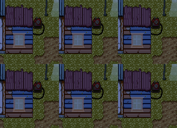
Especially the windows to the houses. I wanted to make it clear that, at night, there were people in the homes. But I just had these big ugly lit blobs that didn't communicate well at all.

Like seriously...what is this gross crap lol.
Trying to do two jams at once
I thought I could keep up the momentum on this one, I really did. And I was doing well balancing working on this with working on my HPSX project. But once I finished Harvester and got hit with that palpable sense of relief, I knew I wasn't going to be able to motivate myself to finish and submit something for HPSX any time soon. Withdrawing from that jam was hard, because I love that community, and I feel like I've dropped the ball on participating in its jams more than I like. Next year, I keep telling myself. And that feeling sucks.
Anyway, it really pulled time away from testing, music, and storytelling. Fine and well, because I'll be going back to that project once I'm sufficiently recouped from the work I put into Harvester.
So, some disappointments, but a lot of wins, as far as I can see. Harvester was fun to make, but I'm really looking forward to doing something different, next, and ideally in a different engine. I have this new project, after all, and there's still some Unduhagge fixes I want to get out before the year ends.
Given the generally underwhelming response to this game, I don't think I'm going to bother with any quality of life improvements. But I guess I'm fine with leaving it as it is: a jam game, warts and all.
Get HARVESTER
HARVESTER
A corpse butchering, demon feeding survival game.
More posts
- HARVESTER is live!Oct 25, 2022

Leave a comment
Log in with itch.io to leave a comment.